A new identity for Mont Owl’s Head and an invitation to somewhere different
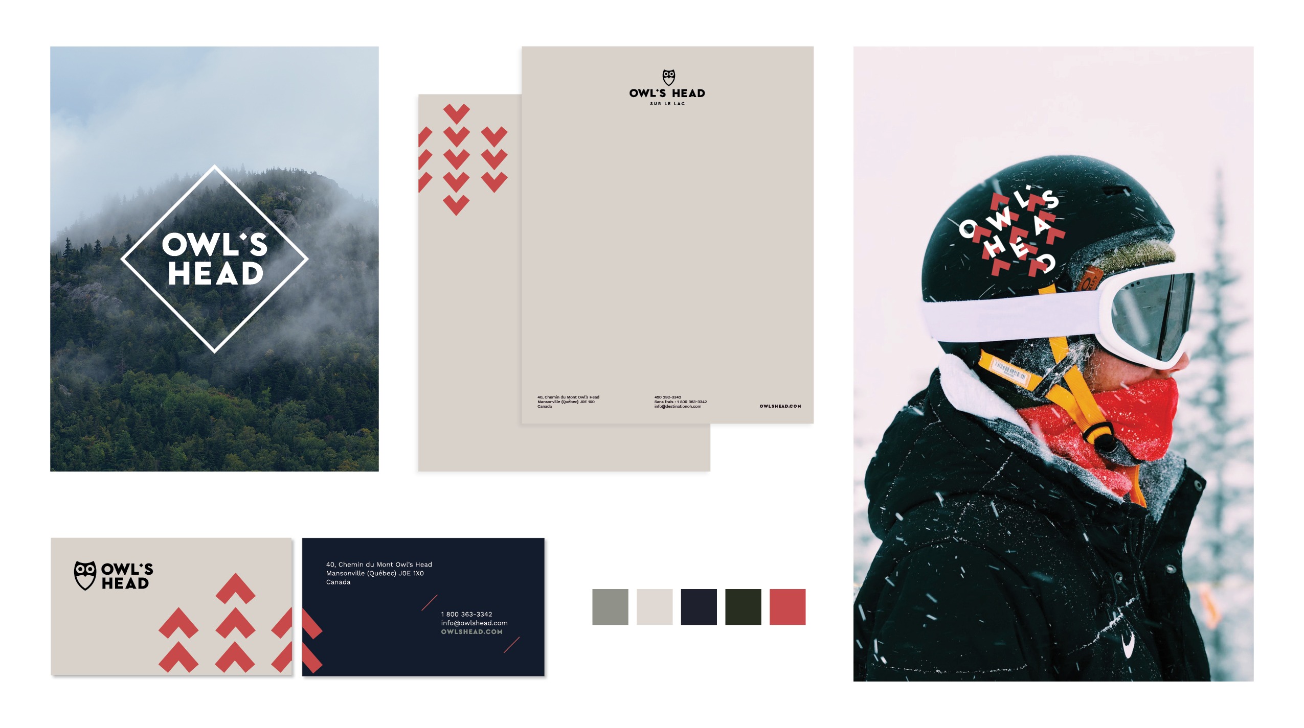
Mont Owl’s Head is repositioning its brand and revamping its visual identity. To keep stride with the changes made to on-site services, the Owl’s Head team is also giving the mountain’s image a makeover. To assist in this transformation, they enlisted the services of creative agency Chacha.
The logo and signature have been updated, the colour palette freshened, and the core message enhanced. Through this new approach, the mountain is revealed at its best.
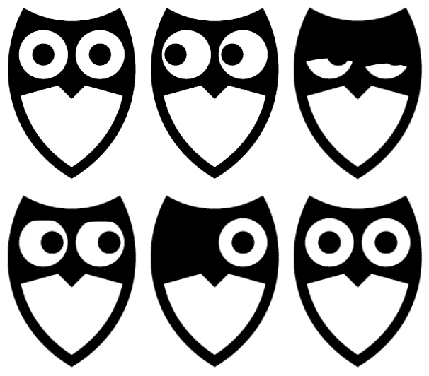
Owl’s Head was fortunate to have the owl already established as its natural icon. We chose to keep that recognizable image as a central element of the mountain’s new visual identity while giving it a modern tweak.

Under the owl, we added a signature to underscore the renewal of Owl’s Head and the ambitious development project that underlies it. Owl’s Head is, first and foremost, the vista of the lake as seen from above, the special quality of the light it reflects, and the majesty of the panoramic landscape.
The new colour choices, meanwhile, are shades of grey, green and blue that convey an understated tone and echo the hues found in nature.
The new identity evokes the mysterious, appeals to the dreamer and alludes to the great legacy of Owl’s Head. We let the natural light speak for itself and bask in a wash of emotional impressions. We are in the here and now. Awed, amazed, and for a moment, detached from the rest of the world.
Because suddenly, we’re somewhere else. Somewhere different.
To announce this visual transformation, Owl’s Head and Chacha Communications have produced a video that will air on social media.
A website designed by Chacha, with a transactional component, will be rolled out before the start of the ski season..


